Dashboard
The Dashboard is XBuddy’s executive command center — a single page that pulls the most important KPIs, charts, and alerts from across every module (Finance, Sales, CRM, HR, Operations, Inventory, and more) into one at-a-glance view. Instead of opening ten apps to understand how the business is doing, leaders open the Dashboard.
It is designed for owners, executives, and department heads who need a fast, trustworthy pulse on the company and the ability to drill from any number straight into the source app that produced it.
Key Features
- Cross-module KPI aggregation (revenue, cash, pipeline, headcount, stock, tickets) on one page
- Fully customizable widget grid — add, remove, resize, and reorder cards
- Global date-range selector that re-scopes every widget at once
- Drill-through: click any KPI or chart segment to jump to the source app pre-filtered
- Mix of KPI cards, trend charts, and alert/attention lists
- Per-role default layouts so each persona sees what matters to them
- Comparison mode (this period vs. previous period) with delta indicators
- Real-time refresh with a manual refresh control and last-updated timestamp
Important features
Customizing your widget layout
Tailor the Dashboard so the numbers you care about appear first.
-
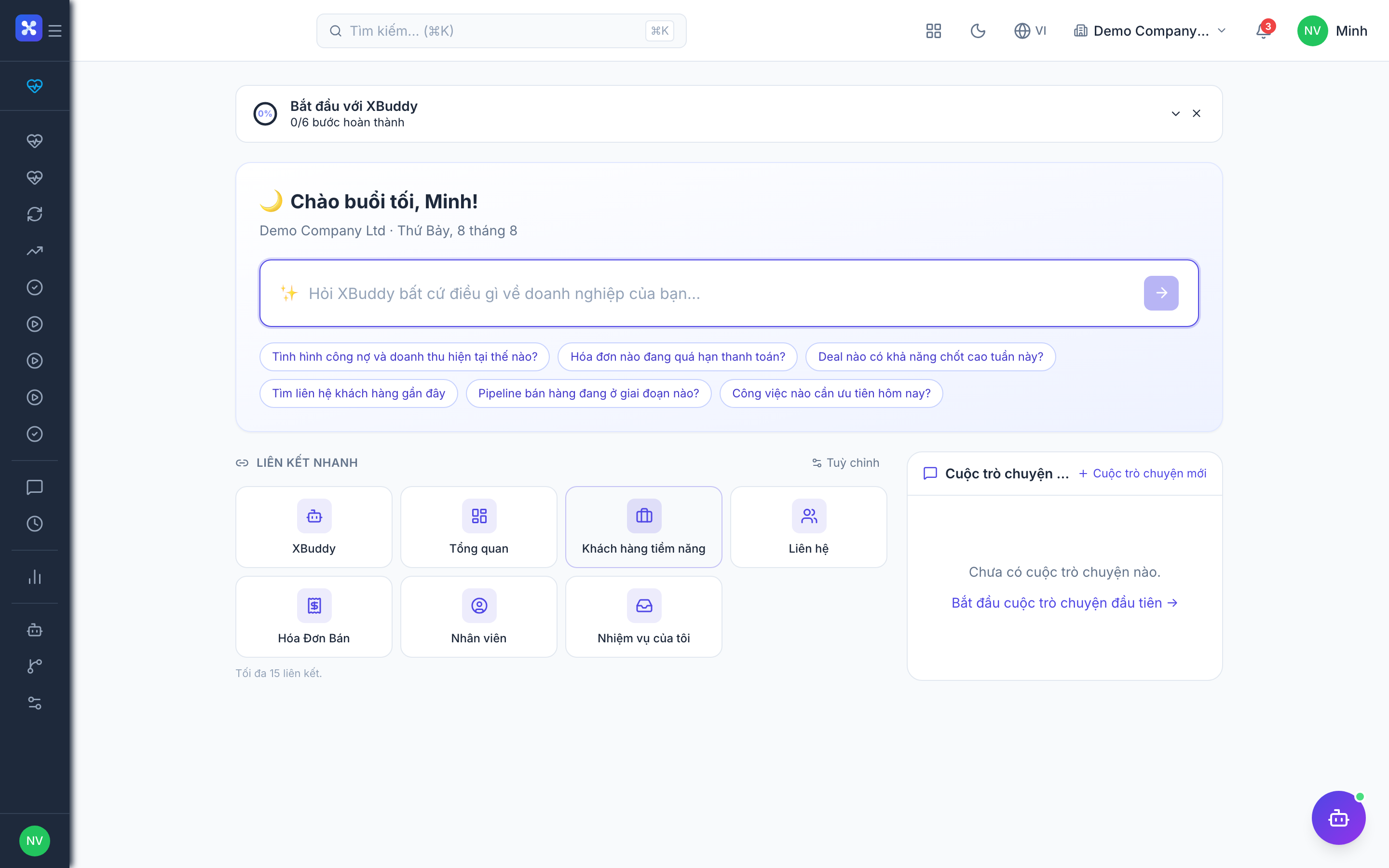
Open /dashboard and click Customize (top-right).
-
Click Add Widget, then pick a source module and a metric (e.g. Finance → Cash Balance, Sales → Pipeline Value).
-
Drag any widget to reorder it, or drag its corner handle to resize (1×1 KPI card up to 2×2 chart).
-
Remove a widget with the × on its header, then click Save Layout to persist it for your account.
Setting the global date range
One control re-scopes every widget on the page so all numbers reflect the same period.
-
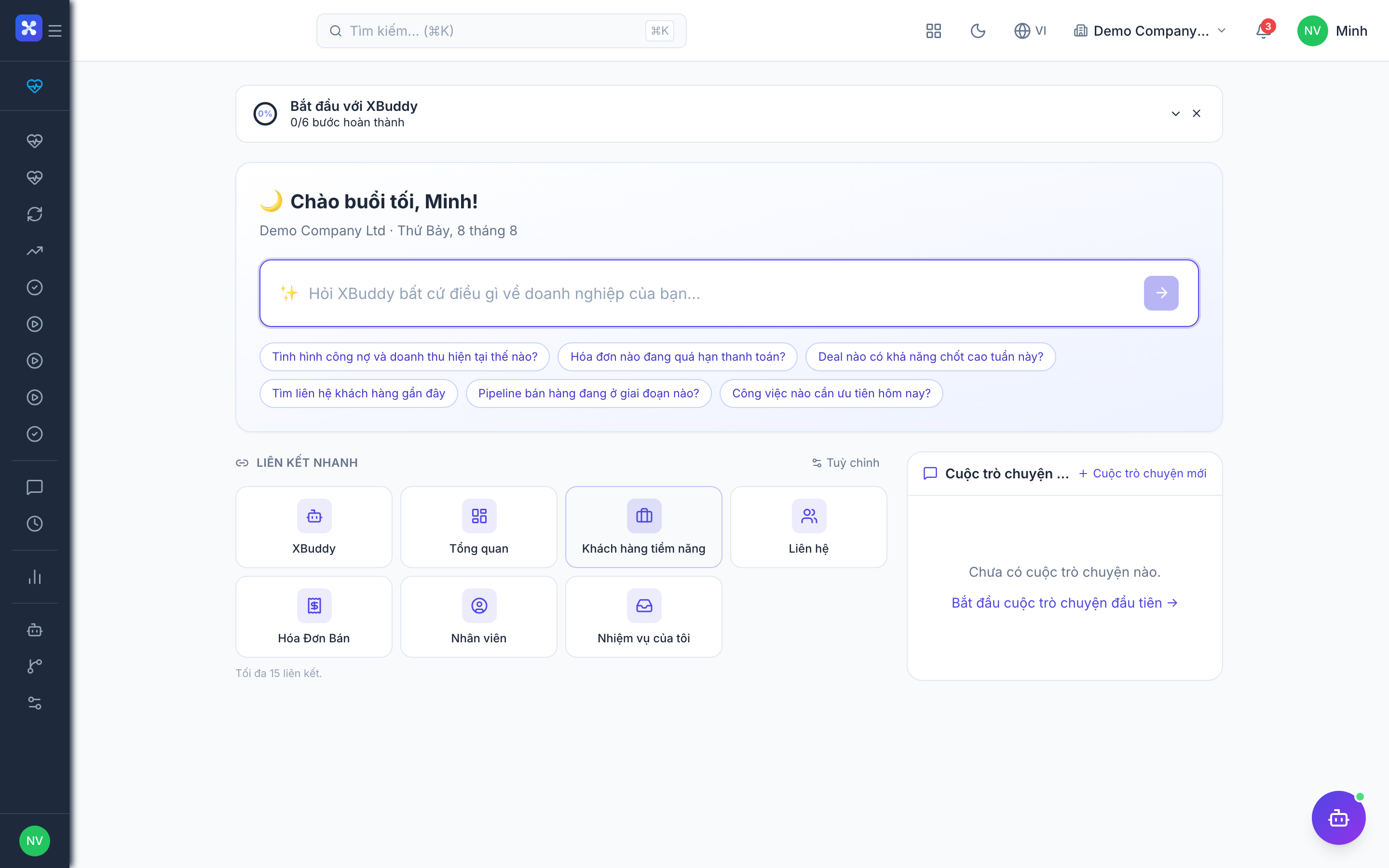
On /dashboard, click the date-range picker in the page header.
-
Choose a preset (Today, This Week, This Month, This Quarter, YTD) or set a custom start/end.
-
Optionally toggle Compare to previous period — each KPI card then shows a delta (▲/▼ %) versus the prior span.
-
The selection is remembered per user until you change it.
Drilling through to the source app
Every widget is a live entry point into the app that owns the data.
-
Hover a KPI card or chart — clickable areas highlight.
-
Click the number, a bar, or a legend item to open the source app (e.g. clicking Overdue Invoices opens /finance/invoices filtered to overdue).
-
The destination app opens with the same date range and filter applied, so the list matches the number you clicked.
-
Use your browser back button to return to the Dashboard with your layout intact.
Reading alert and attention widgets
Beyond trends, the Dashboard surfaces items that need action.
-
Locate attention widgets such as Invoices Overdue, Low-Stock Items, or SLA-Breaching Tickets.
-
Each row is a shortcut — click it to open that record in its source app.
-
Counts update on refresh; a colored badge indicates severity (amber = watch, red = act now).
-
Clear the underlying issue in the source app and the count drops on the next refresh.
Full feature reference
| Nav item | Path | Description |
|---|---|---|
| Dashboard | /dashboard | The single executive KPI page. Renders a customizable grid of widgets that aggregate metrics and charts from all licensed modules. Supports a global date-range selector, period-over-period comparison, drill-through from any widget into the source app, attention/alert lists for items needing action, per-role default layouts, and a manual refresh with a last-updated timestamp. Layout changes are saved per user. |
Integration points
| Module | What the Dashboard reads |
|---|---|
| Finance | Cash balance, revenue, overdue invoices/AR aging, expense totals |
| Sales / CRM | Pipeline value, win rate, new leads, deals closing this period |
| HR / Payroll | Headcount, open positions, upcoming payroll cost |
| Inventory | Stock value, low-stock and out-of-stock item counts |
| Operations / Projects | Active projects, overdue tasks, utilization |
| Service Management | Open tickets, SLA breaches, CSAT |
| Analytics | Shares the same metric definitions so numbers reconcile with reports |
Widgets only appear for modules your tenant has licensed and your role can read. If a KPI you expect is missing, check the app’s module access and your read permission for that resource.
Related AI agents
| Agent | What it contributes to the Dashboard |
|---|---|
| Executive Briefing | Generates a written narrative summary of the period’s KPIs — highlighting wins, risks, and anomalies — that complements the numeric widgets. |
Common workflows
-
Morning executive review
- Open /dashboard; set date range to This Month with Compare to previous period on.
- Scan KPI deltas for red flags (revenue down, overdue AR up).
- Click the Overdue Invoices widget to drill into /finance/invoices and assign follow-ups.
- Return and review the Executive Briefing narrative for context.
-
Building a department-head layout
- Click Customize and remove widgets outside your remit.
- Add the 6–8 KPIs your team owns (e.g. a sales lead: pipeline, win rate, new leads).
- Arrange KPI cards on top, trend charts below, alerts at the bottom.
- Save Layout — it becomes your default on every login.
-
Investigating an anomaly
- Spot an unexpected spike/drop on a trend chart.
- Narrow the global date range around the anomaly.
- Click the affected chart segment to open the source app filtered to that window.
- Inspect the underlying records to find the cause.
FAQ
Q: Does changing the date range affect other users? No. The date range, comparison toggle, and widget layout are stored per user account. Your changes are private to you.
Q: Why is a widget showing “No access”?
The widget’s source module isn’t licensed for your tenant, or your role lacks the read permission for that resource. Ask an admin to grant module access or the relevant permission.
Q: How fresh are the numbers? Widgets refresh on page load and via the manual refresh control; each card shows a last-updated timestamp. There is no long-running cache — the numbers match the source apps.
Q: Can I have more than one dashboard layout? Each user has one saved personal layout. Role-based default layouts are provided out of the box; for multiple saved views, use the Analytics app’s report builder alongside the Dashboard.
Q: Clicking a KPI opens the app but the list doesn’t match the number — why? The drill-through carries the Dashboard’s date range and filter. If the source app has an additional filter still applied from a previous visit, clear it so the two views reconcile.